
Romantic March Wedding at The Newbury Boston
- Dec 30, 2025
- 1 min read
Updated: Mar 31
J+R's March wedding at The Newbury Boston was designed to feel elegant, modern, and effortlessly romantic. The vision focused on a soft palette of creams and whites, layered with subtle pops of blue and gold to create a light, airy atmosphere that still felt warm and intentional.
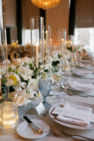
The floral design leaned classic but approachable. Round arrangements in glass vases featured white and cream blooms with gentle touches of greenery for contrast and movement. The addition of clear and gold votives throughout the table scape introduced texture and candlelight, giving the room a soft glow without overpowering the design.
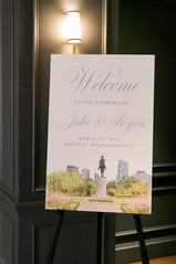
A subtle nod to the venue and surrounding city helped ground the overall look. The parents of the bride got married at the same venue 30 years prior when it was the Ritz-Carlton, so nods to their celebration were seen throughout. Signage and invitations took inspiration from the Public Garden and were in a traditional, classic design emulating a classic hotel ballroom wedding.
As the evening unfolded, candlelight set the tone alongside an elegant champagne tower, adding a polished focal point without feeling overdone. Romantic lighting throughout the space enhanced the neutral palette and highlighted the thoughtful details woven into the design.
The result was a spring celebration that felt balanced and considered—soft but structured, classic with a touch of whimsy. Set at The Newbury Boston, this wedding embraced simplicity, intention, and understated elegance.


Planning + Design: @kellyelizabethevents
Photography: @stephanievegliante
Videography: @willowtreefilms
Florals: @winstonflowersevents
Venue + Catering: @thenewburyboston
Cake: @dessertworksbakery
DJ: @meritagedj @djgreggervais
Hair: @patricevincihair
Makeup: @glamourcosmeticsofficial
Stationery: @serif_sans_designs
Rentals: @peakeventservices @dez.collective
Lighting: @cjc_lighting_and_production
Pet Coordinator: @flpweddings
Dress: @yumikatsuranyc
Suit: @giorgioarmani


The creams, whites, and subtle blue and gold palette sounds absolutely stunning! I've been looking for inspiration for a similar March wedding setup. https://3d-ai-generator.com
The creams, whites, and subtle blue and gold palette sounds absolutely dreamy for a March wedding. Those round glass vase arrangements with the gold votives are such a lovely touch — I've been looking for exactly that kind of elegant, airy inspiration. https://image-gpt.net
The creams-and-blues palette with those round glass vase arrangements looks absolutely dreamy — I've been searching for florists who can pull off that exact airy, modern vibe https://framepack-ai.com
The soft creams, blues, and golds at The Newbury Boston were gorgeous. I'd love to see the floral details more—Check out https://pika-labs-ai.com
The creams, whites, and subtle blue-and-gold accents are stunning — those glass vase arrangements look like a dream. I've been using https://banana-nano.co